I have looked into the conventions of a film poster. Some of the conventions seen on film posters are:
Images are used to catch the audiences eye when they pass the poster. The images are usually shots from the film or character shots. They contain aspects to show the genre of the film and give away something about the film. The image has to be clear as it portrays the story of the film.
The film title is an important part of a film poster. This is because without it the audience wont know what it is called and they wont be able to look up information on it.
Film posters need to include narrative elements. This is important to include this so that the audience have an idea of the storyline. For example for romantic films there are usually couples shown on the poster, and on horror posters there is usually blood.
Film posters need to include narrative elements. This is important to include this so that the audience have an idea of the storyline. For example for romantic films there are usually couples shown on the poster, and on horror posters there is usually blood.
Tag lines are used on film posters to give audiences a hint to what will happen in the film. they aimed to be memorable for audiences so that they think about the film when they think of the tagline. Sometimes tag lines are direct quote from the film or even rhetorical questions. Their purpose is to tease the viewer.
The location seen in film posters can be an important part it. Having the subject of the image in a certain location will give the audience an idea of where the film will be set and it could also help tell the genre or story line of the film.
The release date on film posters are made to be clear. This is because people don't want to search the poster for long to find the date.
 At the bottom of film posters is the credits block. This includes the studio name, producers, script writers, musician, designer name, editors name, cinematographer, executive producers, story writer, screen writer and directors name.
Star ratings and critics reviews are sometimes used on film posters. These are used to enhance the films representation.
 In film posters there are different icons. These are icons to say about the film being in 3D. There are also sometimes icons for advertising for example for Facebook and Twitter.
 In film posters there are different icons. These are icons to say about the film being in 3D. There are also sometimes icons for advertising for example for Facebook and Twitter.
 Film posters can be seen on buses, billboards,newspapers and magazines.
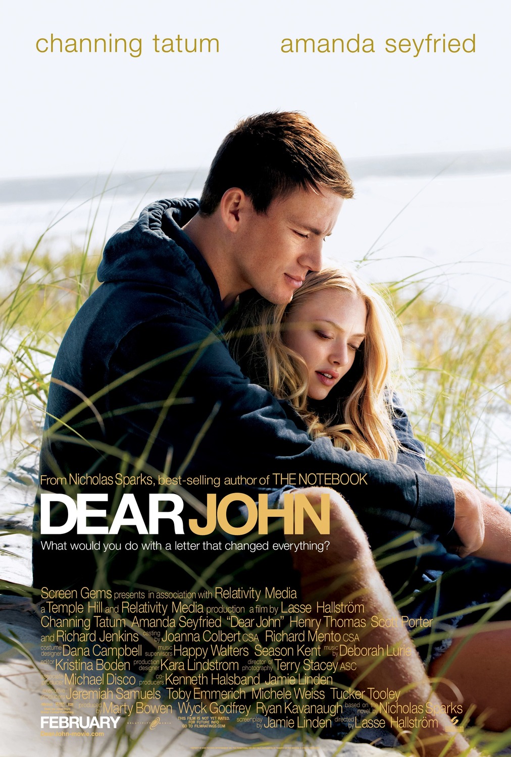
Dear John film poster:
I have looked at this film poster as it is a romance film which I am thinking about doing.
The way the two characters are sitting look quite relaxed but having the sea in the background could show that they get separated.

Harry Potter film poster:

If these posters didn't have a picture they wouldn't work very well as the picture is one of the most important parts of a film poster. Without it, it would look plain and boring and people wouldn't be interested in seeing the film as there was nothing to catch their attention. If these posters had different texts for the title it would be less recognisable as people know the film to be in this font.

Hansel and Gretel Witch Hunters film poster:
I have looked at this film poster as it comes under the genre of action horror and fantasy.
If this poster didn't have the title in this text and colour people might get the wrong idea about the film as this tells a lot about it.

Epic film poster:
I have looked at this poster as it is different in the way that it is completely animated and that it is aimed at children.

These are two different Harry Potter film posters. The first one is from Harry Potter and The Philosopher's Stone, the second is from Harry Potter and the Order of The Phoenix. They have a few similarities and a few differences. for example they are both very different in the way they have been shown as in the first one there are many photos in one and in the second one there is only one photo. They both have the same main character on in the middle and the same font for the titles.

If these posters didn't have a picture they wouldn't work very well as the picture is one of the most important parts of a film poster. Without it, it would look plain and boring and people wouldn't be interested in seeing the film as there was nothing to catch their attention. If these posters had different texts for the title it would be less recognisable as people know the film to be in this font.
I have looked at this film poster as it comes under the genre of action horror and fantasy.
If this poster didn't have the title in this text and colour people might get the wrong idea about the film as this tells a lot about it.

Epic film poster:
I have looked at this poster as it is different in the way that it is completely animated and that it is aimed at children.

No comments:
Post a Comment